Every business owner aims to provide their users with an engaging experience when they visit their website. But, if your website is low responsive, it will result in a negative user experience. Moreover, will lower search ranking and reduce customer and visitor conversion into leads.
Website Responsiveness is one of the critical factors that determine users’ image of your business. A responsive web design delivers a consistent and optimized user experience across device sizes and screens. There are loads of benefits that
Responsive Web Design Services deliver. Such as increased website response with better user experience, more traffic flow, and improved and embraced SEO.
Want to increase the website responsiveness organically? Looking to see visible results?
Get higher search rankings and more reach by effectively managing the content area and various design elements. These involve easy navigation, attractive visuals, headings, organized paragraphs, etc
Conclusively, resulting in a high conversion rate with overall increased ROI of the business. Here are six organic ways to increase website responsiveness:
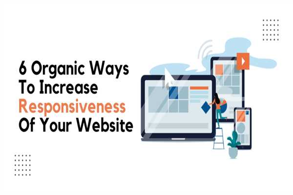
6 Ways To Increase Responsiveness Of Your Website:
1. Set Appropriate Responsive Breakpoints:
Setting an appropriate breakpoint tremendously increases website responsiveness. It enables the website's content and design to adapt in a particular way providing the best possible user experience. Every user access website with different devices that have different screen sizes and resolutions. This responsive functioning feature structures perfectly across every screen type and size.
Website content adjusts to the screen size with an accurate layout without distorting the content and visuals.
2. Incorporate a Fluid Grid:
Adapting to a fluid grid facilitates a unique visual presentation of the website’s different layouts in response to the different displaying devices. Such as different-sized desktop computers, laptops, and smart-phone.
The layout of a website should be able to adapt and respond as per the dimensions of the device being displayed.
3. Take Touchscreens Into Consideration:
With the evolution of touchscreen technology, incredible growth has been visible. Touchscreen helps devices operate faster. Whether you're creating or upgrading your website for a desktop computer or laptop, focus on creating a touchscreen-responsive website design. It will not only help mobile-phone users but laptop and desktop computer users.
Most Importantly, consider mouse click users as well. That facilitates pressing and scrolling with a fingertip touch obscuring a large view of the screen.
4. Optimize Visuals For Fast-Loading Speed:
Slow-Loading web pages affect search engine rankings. If your website's home page takes a long to load, visitors will abandon the web page. It is essential to have a fast-loading web page to engage a significant amount of traffic flow and increase the conversion rate.
Unoptimized images on the webpage take up more than 60% of the total webpage weight which increases the webpage's weight. Upload media elements and visuals that are clearly visible and have small-screen access to your website.
Here are a few of the effective ways to speed up the loading speed of your website:
Use an image-compression tool to compress your images.
Reduce the image-size, to make images load quickly
Make use of a proper file extension when saving images. Extensions like PNG, JPEG, and GIF.
5. Try a Pre-Defined Theme or Layout To Save Time:
If you have little or no knowledge about the technical aspects of a website, try and make use of pre-designed
responsive themes or layouts. Today, every website owner understands the importance of themes. There are beautiful pre-designed themes and templates that work for every and all types of devices.
Take a look at the features of the particular theme, before choosing the one. If the theme you want is responsive, then all you need to do is make changes in the background color, layout, and content to match the requirements of your business.
If you're finding it difficult or not able to do it on your own, consult one of the experienced website designing companies that will guide and help you well.
6. Evaluate Web Design Responsiveness on Real Devices:
Testing the website design on a range of devices evaluates the responsiveness compatibility of a website. Executing website testing not only helps in checking the website’s responsiveness but also offers benefits for your business.
Proper visibility and increased responsiveness emphasize quality, functionality, and better usability resulting in attracting more traffic and accomplishing more sales.
The Bottom Line:
If you’re finding it difficult to optimize your website for every single device, or facing challenges on the way, get expert assistance from top-ranked web designing companies. They can provide the best quality services and dynamically adapt to different browsers. With a more realistic design and without changing the content and layout, it looks perfect on all devices.
Hiring a professional team with advanced technologies can also help create an overall well-designed and responsive website. They possess years of experience and have relevant knowledge, expertise, and skills to help you build the best responsive website. Their assistance will ensure top SEO ranking, great lead conversion, and even doubling your ROI.


Leave a Comment