Today the world is totally incomplete without the use of mobile internet. Around 50% of the web pages are viewed on mobile phones, and the number is growing dramatically. The use of mobile phones is more of a habit these days. Google responsive website is searched in more phones along with computer screens. You know why? Because people are making a drastic shift from desktop-centric to mobile-centric, having a responsive design is more significant than ever. When we have a better understanding of how mobile responsive web benefits SEO, then you might think that it’s more important to aim to have a mobile site.
What does a Responsive website mean and how does it affect your SEO?
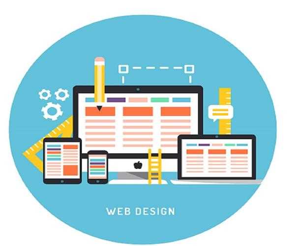
A responsive website is the one that represents a most favorable viewing experience, which results in having easy reading and navigation with a minimum of resizing, panning, and scrolling. The main purpose of a responsive design is to increase the reach of your website to have a large base of users that has an array of devices. You might be surprised to know that having a responsive web design can affect your SEO score too. So, want to know how it affects SEO?
1. Google favors Responsive web design
In the year 2015, Google came up with a new mobile ranking system that supports mobile-friendly websites as an important part of SEO ranking signal. The website capability helped in using a single URL that made it easier to link as well as share contents on different websites. This results in speeding up the page load as there is no need for redirection. These factors support Google Ranking Signals.
2. Improves Site Usability
An SEO-friendly website helps in driving traffic, but in the case of adaptive web design that will help in keeping the users as it results in optimizing the website in order to fit in any device. Simple navigation of your website results in having a great user experience and having extended time on your website.
Increasing your site usability and good user experience can lead to having a consistently good user experience can result in having lead generation, sales and conversions. Web marketing agencies, businesses, and social networking strategists must work on-site usability.
Benefits of Responsive Web Design for SEO
Benefits of responsive design & SEO and your overall digital marketing efforts. Check out a few of the top reasons below:
1. Better User Signals
A variety of user signals combine to be a big ranking factor. Having a mobile and tablet version improves these, and will have a big second-hand impact on your rankings.
If a user accesses a site with a responsive design, they’ll stay on the site longer, visit more pages, and are much less likely to leave right away (reducing bounce rate). All of these are signs of a quality page, which search engines will take into consideration.
2. Ranking Boost
Google responsive website provides a significant ranking that helps in boosting both mobile as well as desktop. They are mobile friendly as well as tablet-friendly. These help in setting up priorities, where every well-ranking site has its own mobile version.
Websites that don’t provide a good user experience on mobile are most likely to rank in phone searches that result in cutting off from a lot of prospective traffic.
3. Mobile-responsive is simple to deal with as it has great ROI!
Generating mobile-responsive sites is taken as the best practice for all types of websites. In fact, many CMS platforms will begin to provide complete and customizable responsive designs in their portfolios. Working on the mobile or desktop sites demand an ample amount of time when required updates. With the help of mobile-responsive sites, you only need to keep a check on the website that would save time and energy.
4. Online shopping is trending!
According to a study, 62% of mobile users have made purchases using their smart devices. Your online business site needs to be promoted and also let others promote through different forms of social media such as Facebook, Twitter, Instagram, Pinterest, etc. Having mobile-friendly conversion points should be such that it connects with the customers in the best possible way. Repeatedly, content should be posted and supported for connecting with customers and followers. This platform helps to advertise, connect with influencers on every platform for gaining more potential buyers.
5. Speed up your website
Accelerated Mobile Pages (AMP) is the one who helps to speed up the usage of the mobile web. However, it is somehow getting controversial, and it is not taken to be the most excellent solution for improving the speed of the websites. It is taken for emergency cases known to be ‘quick fix’.
Do prioritize the speed for your authentic site, but don’t patch up Google-owned to fix it up. The main factor is ranking, that is the site speed. But, do keep a check as there are many different ways you can improve your performance. Different tools are available to check the speed of your site and then accessing your report, where betterment can be made.
Conclusion
The first thing in your list must be to incorporate a google responsive web design to provide you with ample time for planning. A well planned will result in having great as well as a thoughtful design. Planning also helps in mapping as to what you think the website should look like, keeping the purpose of the website in mind which is the advantages of responsive web design for users and help you in your long-term SEO goals.


Leave a Comment