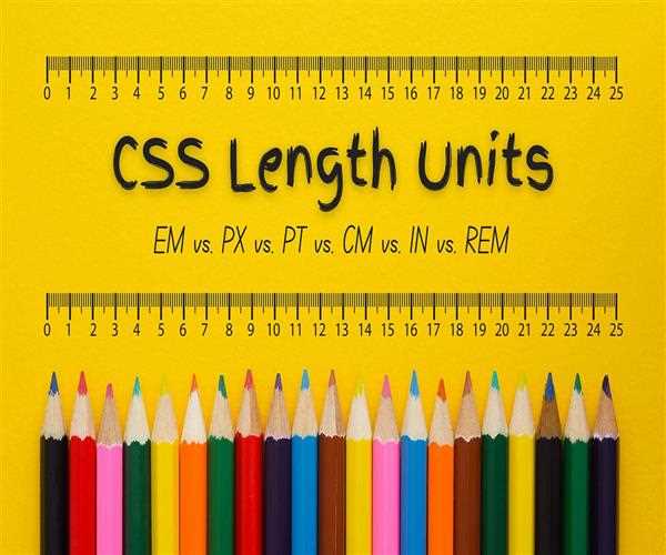
Understanding CSS units is crucial for accurately sizing and positioning elements on a webpage. Here's an overview of some commonly used CSS units:
Pixels (px):
- Pixels are a fixed unit of measurement.
- They provide a precise control over element sizes.
- One pixel is typically equal to one device pixel, making them consistent across devices with different pixel densities.
- However, they are not easily scalable and may not adapt well to different screen sizes or user preferences.
Example -
.box {
    width: 200px;
    height: 100px;
    border: 2px solid black;
}
In this example, .box has a fixed width of 200 pixels and a fixed height of 100 pixels. Regardless of the context, the box will always be 200 pixels wide and 100 pixels high.
Ems (em):
- The
emunit is relative to the font size of the element. - For example, if an element has a font size of 16px,
1emis equal to 16px. - If an element has a font size of 20px,
1emis equal to 20px. - This makes
emunits versatile for responsive design because they scale relative to the font size of their parent elements. - However, nesting elements with
emunits can lead to compounding effects, making it challenging to predict sizes accurately.
Example -
.parent {
    font-size: 16px;
}

.child {
    font-size: 1.5em; /* 1.5 times the font size of the parent */
}
Here, the font size of .child is 1.5 times the font size of its parent
.parent. If .parent has a font size of 16px, .child will have a font size of 24px (16px * 1.5).
Root em (rem):
- Similar to
emunits, but relative to the font size of the root element (<html>). - This makes
remunits particularly useful for establishing a consistent sizing scale across the entire webpage. - They avoid the compounding effects of nested
emunits since they are always relative to the root element's font size. remunits are excellent for managing global layout and typography.
Example -
html {
    font-size: 16px;
}

.box {
    width: 10rem; /* 10 times the font size of the root element */
}
If the root element (<html>) has a font size of 16px, then
1rem is equal to 16px. So, the width of .box will be 160px (16px * 10).
Centimeters (cm):
- Centimeters are absolute units of measurement.
- They are primarily used for print stylesheets or when precise physical dimensions are required.
- Unlike pixels, they can adjust based on the user's printer settings or screen resolution.
Example -
.box {
    width: 5cm; /* 5 centimeters */
    height: 3cm; /* 3 centimeters */
    border: 1px solid black;
}
In this example, the .box element will have a width of 5 centimeters and a height of 3 centimeters. The actual size of the screen depends on the screen resolution and the user's display settings.
Absolute Lengths
The absolute length units are fixed and a length expressed in any of these will appear as exactly that size.
| Unit | Description |
|---|---|
| cm | centimeters |
| mm | millimeters |
| in | inches (1in = 96px = 2.54cm) |
| px * | pixels (1px = 1/96th of 1in) |
| pt | points (1pt = 1/72 of 1in) |
| pc | picas (1pc = 12 pt) |
Relative Lengths
Relative length units specify a length relative to another length property. Relative length units scale better between different rendering mediums.
| Unit | Description |
|---|---|
| em | Relative to the font-size of the element (2em means 2 times the size of the current font) |
| ex | Relative to the x-height of the current font (rarely used) |
| ch | Relative to the width of the "0" (zero) |
| rem | Relative to font-size of the root element |
| vw | Relative to 1% of the width of the viewport* |
| vh | Relative to 1% of the height of the viewport* |
| vmin | Relative to 1% of viewport's* smaller dimension |
| vmax | Relative to 1% of viewport's* larger dimension |
| % | Relative to the parent element |
Each unit has its strengths and use cases, and choosing the right one depends on factors like the design requirements, scalability, and accessibility considerations of your webpage.


Leave Comment