Responsive website designs are everywhere. It is one of the biggest trends in the website designing field that has changed the way websites work across different gadgets and platforms.
With responsive web design, your website can be operated smoothly across laptop screens, smartphones, tablets, etc with website befitting the screen perfectly. And this rage has been so moving that even Google smacks down the websites that aren't responsive.
Before web design, companies operated different websites to create a personalized experience for the customers of different gadgets.
The freelance web designer in Delhi designed separate websites for laptops, smartphones, blackberry, tablets, etc. With responsive web design, the stress has been divided into just a fraction. Here is how responsive web design works!
Responsive Web Design – What is it!
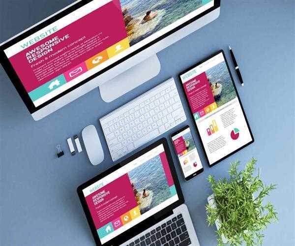
A Responsive Web Design is all about creating one website that is easily responsive across vivid gadgets, resolutions, display sizes, etc. Operating under the same syntax, the same domain, and the same context, the CSS3 Media Queries, and Javascript are manipulated in the design to make the website perform across vivid viewports.
Instead of creating a new website for responding to a new viewport, the same website acts as an underlying base for vivid javascript and web deployment ideas to make the viewing through different viewports possible.
What makes Responsive Web Design possible!
Implementing a responsive web design requires working on one base website to create multiple modules and media queries that fetch the diverse appearance of the web design. It is possible in the following three functions.
• Creating an adaptive layout of the website which utilizes the media queries to suit the diverse screen sizes
• Working with the grid that translates the screens into relative units of percentages
• Use of flexible images that work in a certain bandwidth to create a scaled experience
What is the need for responsive web design!
For any company to get a solicited presence over the web, a website is pretty much a need. It translates as an online identity for the businesses. As a result, when creating the website, the company wants the website to be accessible to the customers using not just PCs or laptops but also covering the large segment of an audience from the smartphone users to the tablets users.
A responsive design enables a website to scale to the screen size, pixel range, browsing experience, etc across vivid viewports to craft a suitable browsing experience seamlessly. Unlike the old metrics where companies created a new website for each viewport, responsive web design cuts down the efforts into just one robust website that becomes a platform for all information access and browsing.
Target the largest user segment
Over the years mobile phone users have surpassed the number of desktop or laptop users. While in 2009 only 1.2% of the internet traffic was from mobile phones, today more than 80% of the internet traffic comes from the use of smartphones and tablets.
Using a responsive web design helps the businesses reach the larger segment of the audience across their devices easily.
Responsive web design means that users can browse through the website through their system browsers of Android, Windows, and IOS and get access to the data on the website in just as well designed and representative way as the desktop version of the website.
Optimal viewing and interaction experience
About 45% of the traffic is lost if the website doesn’t load in 3 seconds. The fact is truer and fiercer when it comes to mobile platforms. In the smartphone world, people have access to the internet through their phones.
It has become the most powerful medium to capture the audience and turn them into leads. Without responsive web design, although the website design shall open across the mobile phone browsers but wouldn’t promise a smooth or satisfying browsing experience.
The lack of size optimization, fonts, navigation, panning, etc is compromised. But with the responsive web design, the task gets easier and smarter. The websites come with a smart and seamless version on the smartphone devices giving the users an optimal viewing and interaction experience for a satisfying use of the website. It, therefore, captures the audience and helps create a customer base.
Hamburger menu for the navigation
Unlike the usual navigation bars available on the website for sound browsing of the platform, responsive web design uses the Hamburger menu for the navigation.
This is because if the mobile version included as many navigation bars and page links as is displayed on the website, the mobile version would feel like loaded with links with no space to the main features.
The hamburger menu hides away the navigation in the form of a drop-down or a touch open menu for the users to find their navigational tools in one menu. It works in creating effective browsing experience across greater amounts of content.
Content remains the same
Be it the website browsing through the PC or viewing at the website through a smartphone, the content on the responsive web design remains the same. There is no need for the company to create different content, change the tags or introduce something new to each platform. When something is added to the base website, it becomes optimized and viewable across different viewports too.
Google supports responsive web design
Ever since smartphones have become a key sector for internet users to visit the websites, Google has changed its algorithm to lend necessary attention to the websites with responsive web design.
Today the largest SERP doesn’t pick the websites with non-responsive web design to include in its ranking and listing. Enabling Google to provide for only websites that are easily browsable across the mobile platforms, responsive web design works seamlessly into creating sound browsing experience.
A responsive web design created by the freelance web designer in Delhi promises not just optimal performance and enhanced browsing but also brings ease of content sharing across the target audience for a rewarding experience.


Leave a Comment